On July 29, 1966, Bob Dylan crashed his motorcycle in or around Woodstock, New York. Nobody called the police, so there was no official report of the accident, or even a press release—just a two-sentence item a few days later on page 30 of The New York Times.
In the four years leading up to the crash, Dylan had released seven albums and played more than 150 shows. Now he was laid up with a spinal injury in the Victorian home of a country doctor, his future uncertain. A promised book and concert documentary were in limbo. A 64-date international tour was canceled. When his next LP would arrive, only Dylan knew, and maybe not even him.
Months went by without a word. In desperation, executives at Columbia Records went ahead and repackaged some old product. While Dylan himself was apparently furious for not having been consulted, his fans were ecstatic. Certified five times platinum, Bob Dylan’s Greatest Hits is the singer’s best-selling album in the U.S.
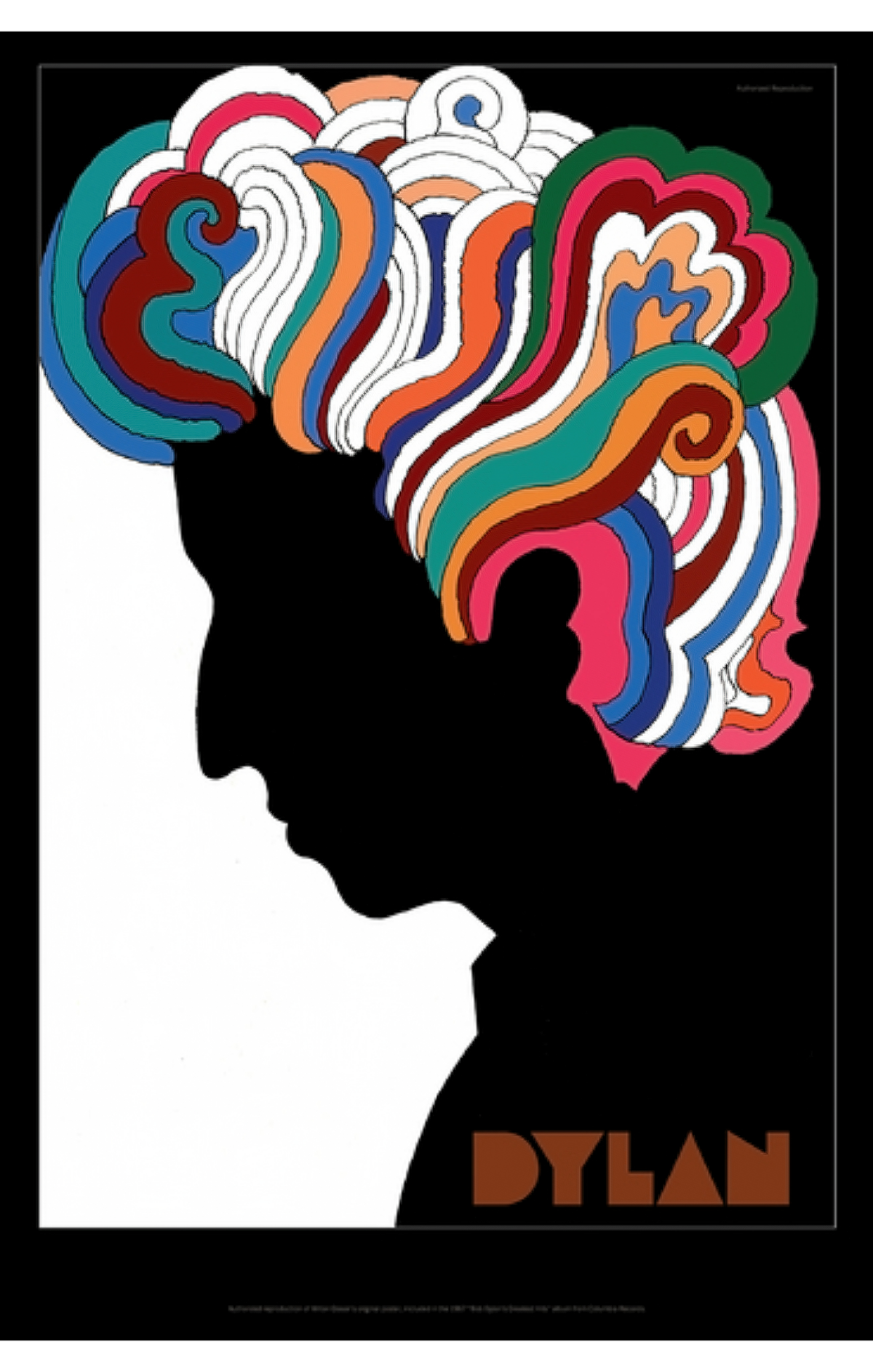
But its lasting cultural significance rests on the free poster tucked inside each record sleeve, which has been exhibited in the Museum of Modern Art; the National Portrait Gallery in Washington, D.C.; the Musée des Arts Décoratifs, at the Louvre; and dorm rooms across America, among other places.
“One day a French photographer visited the studio and told the following story,” the poster’s designer, Milton Glaser, of Push Pin Studios, later recalled. “He was on assignment traveling up the Amazon and stopped in a village of about one hundred Indians. He entered a hut and, as his eyes grew accustomed to the darkness, he saw the Dylan poster on the wall. He never was able to find out how it got there.”
The poster shows Dylan’s distinctive profile in downcast silhouette, his unruly hair rendered in psychedelic swirls. A single word, “DYLAN,” sits in the bottom-right corner, set in geometric capitals. Drawing from a 1957 Marcel Duchamp self-portrait, decorative Persian miniatures, and a hand-lettered sign for a tailor’s shop that caught his eye in Mexico City, Glaser combined three previously unacquainted aesthetic elements from the near and distant past to create something wholly new. “A design historian might call us premature postmodernists,” he said.
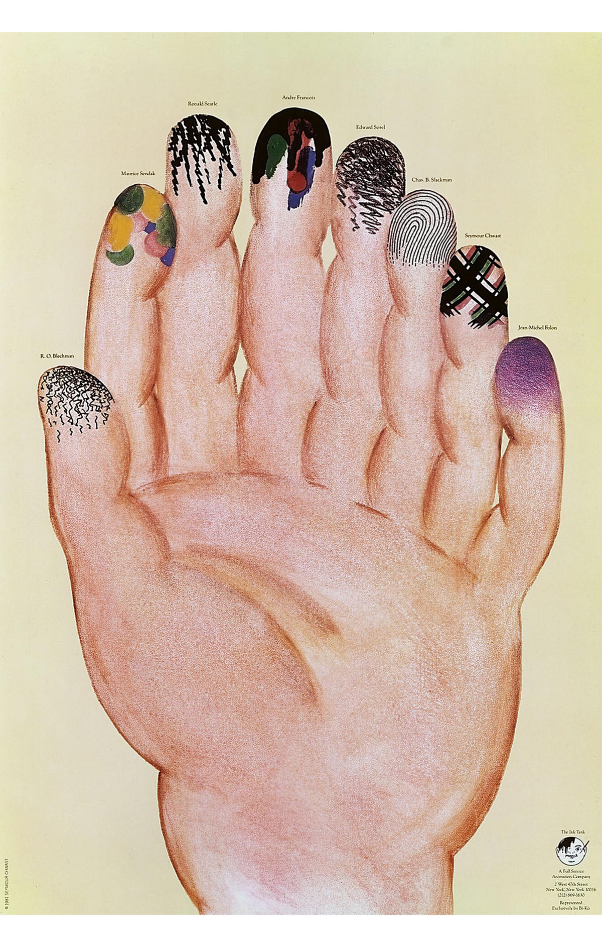
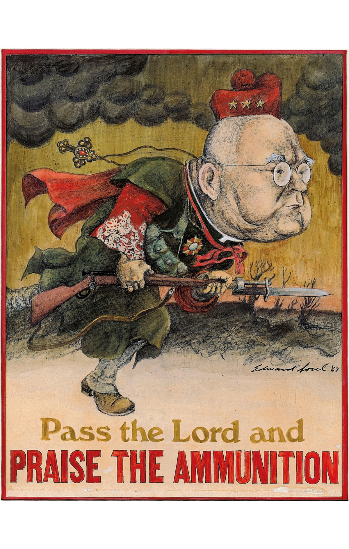
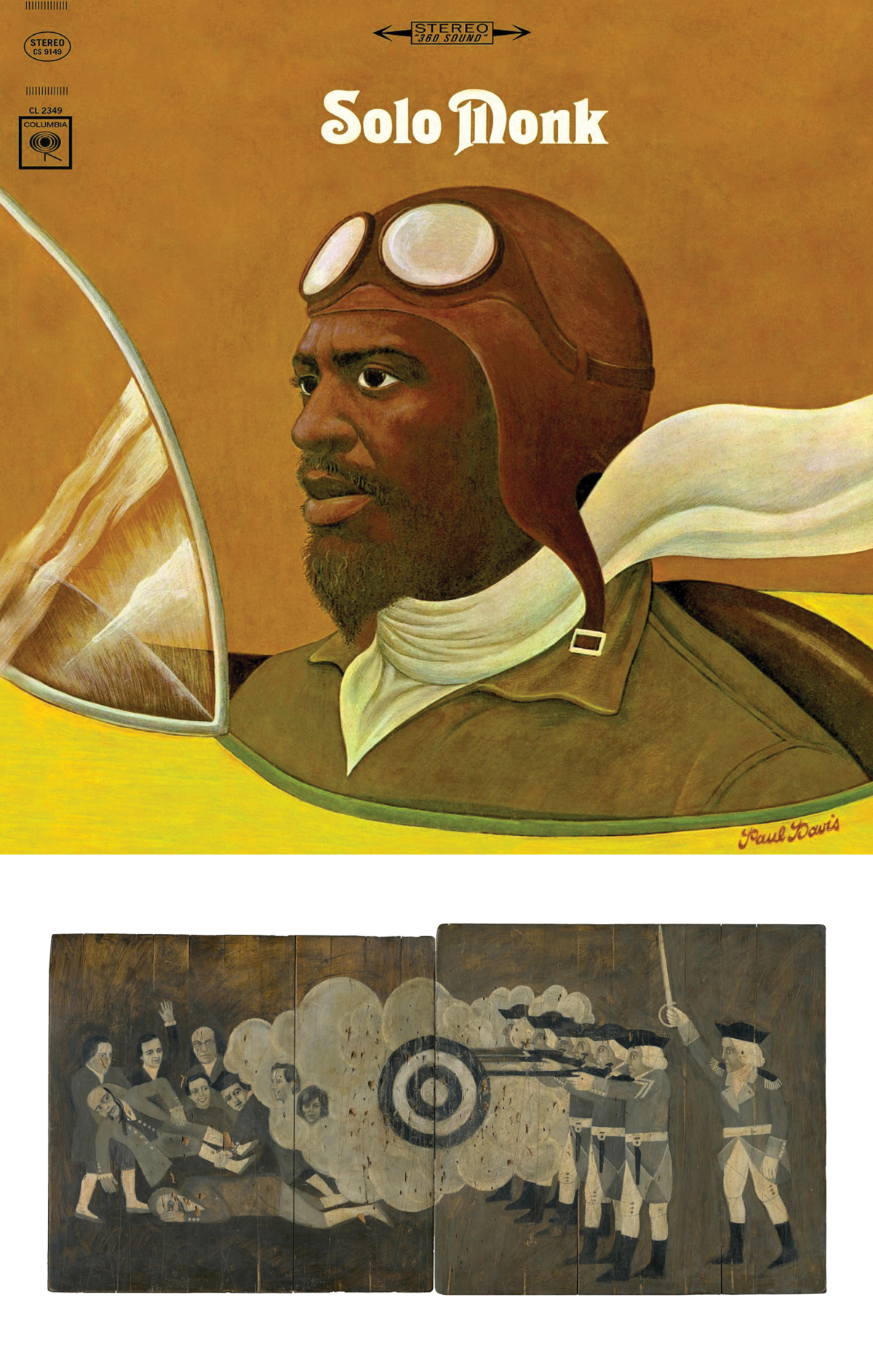
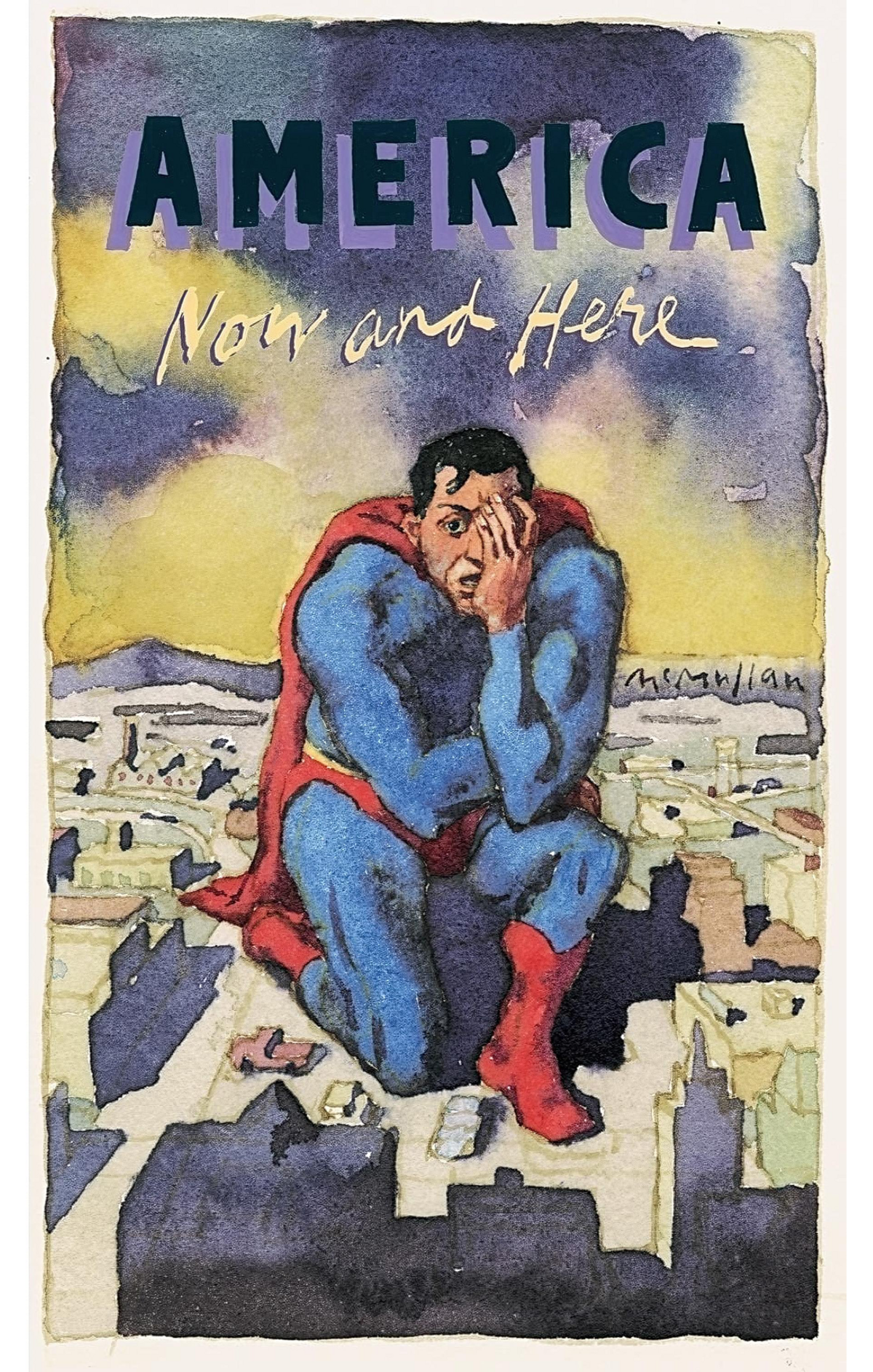
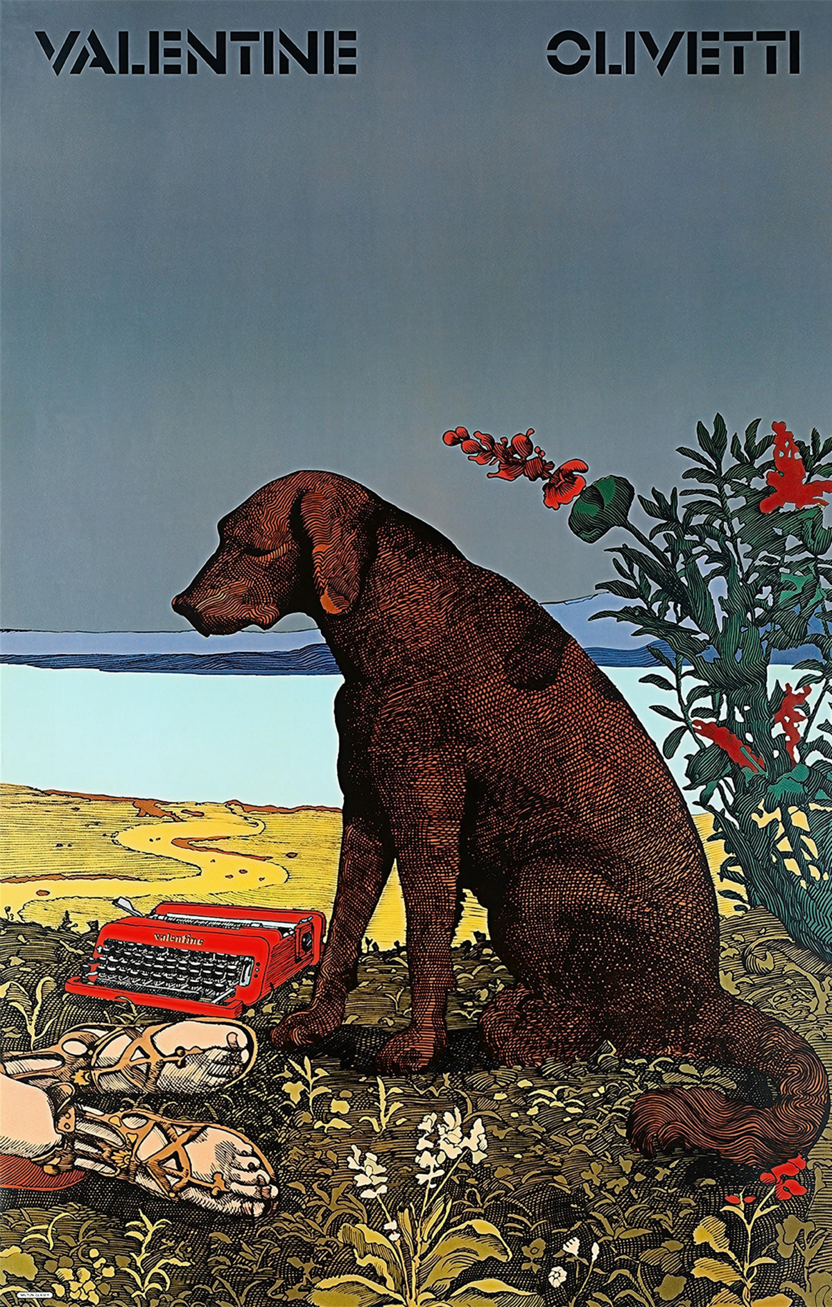
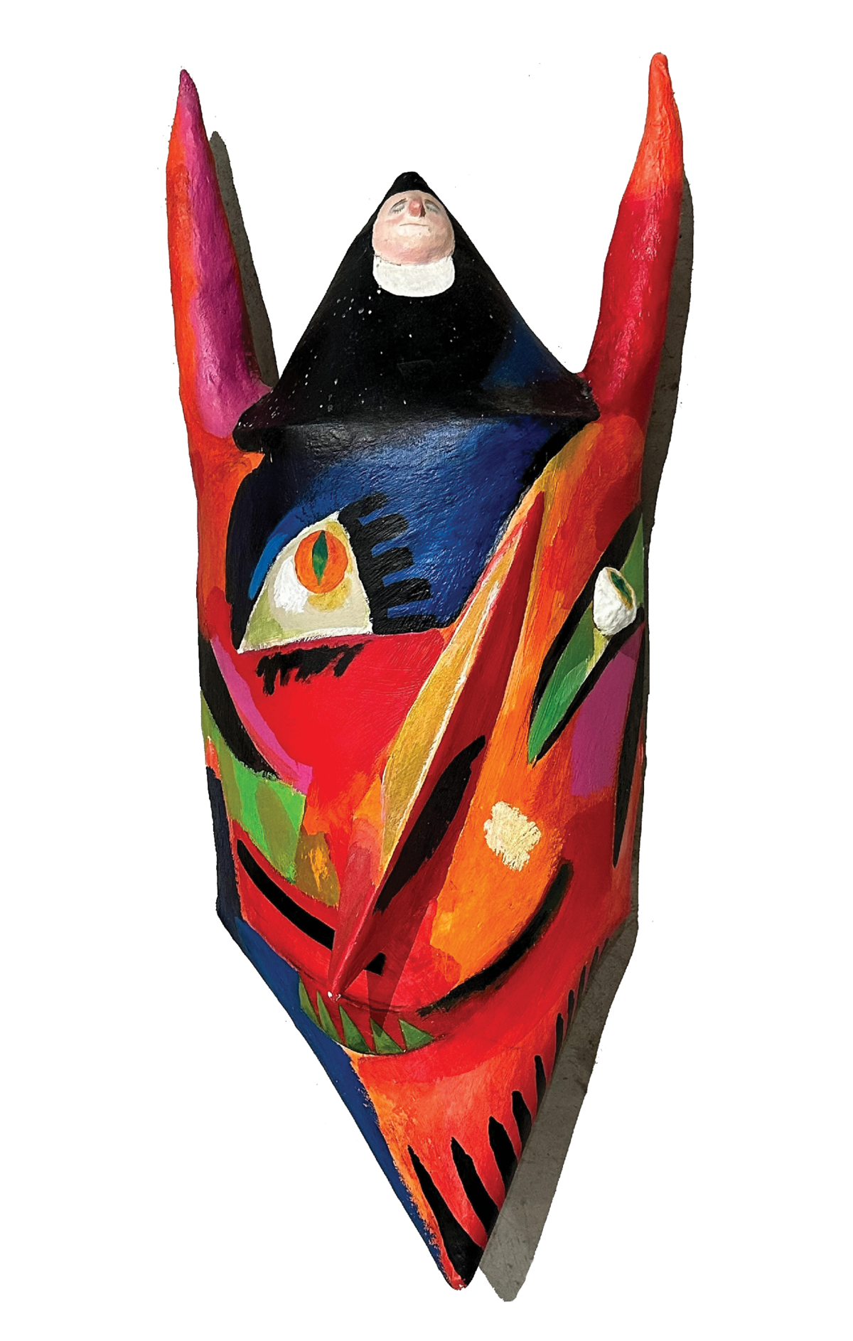
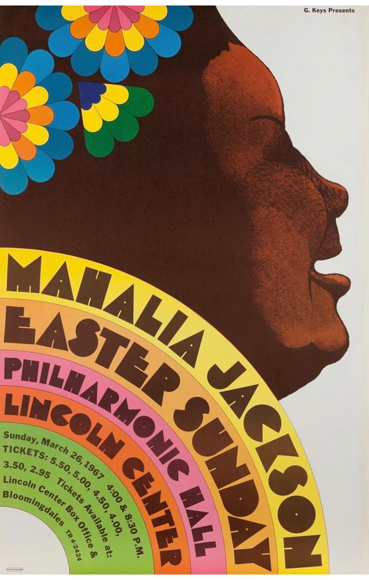
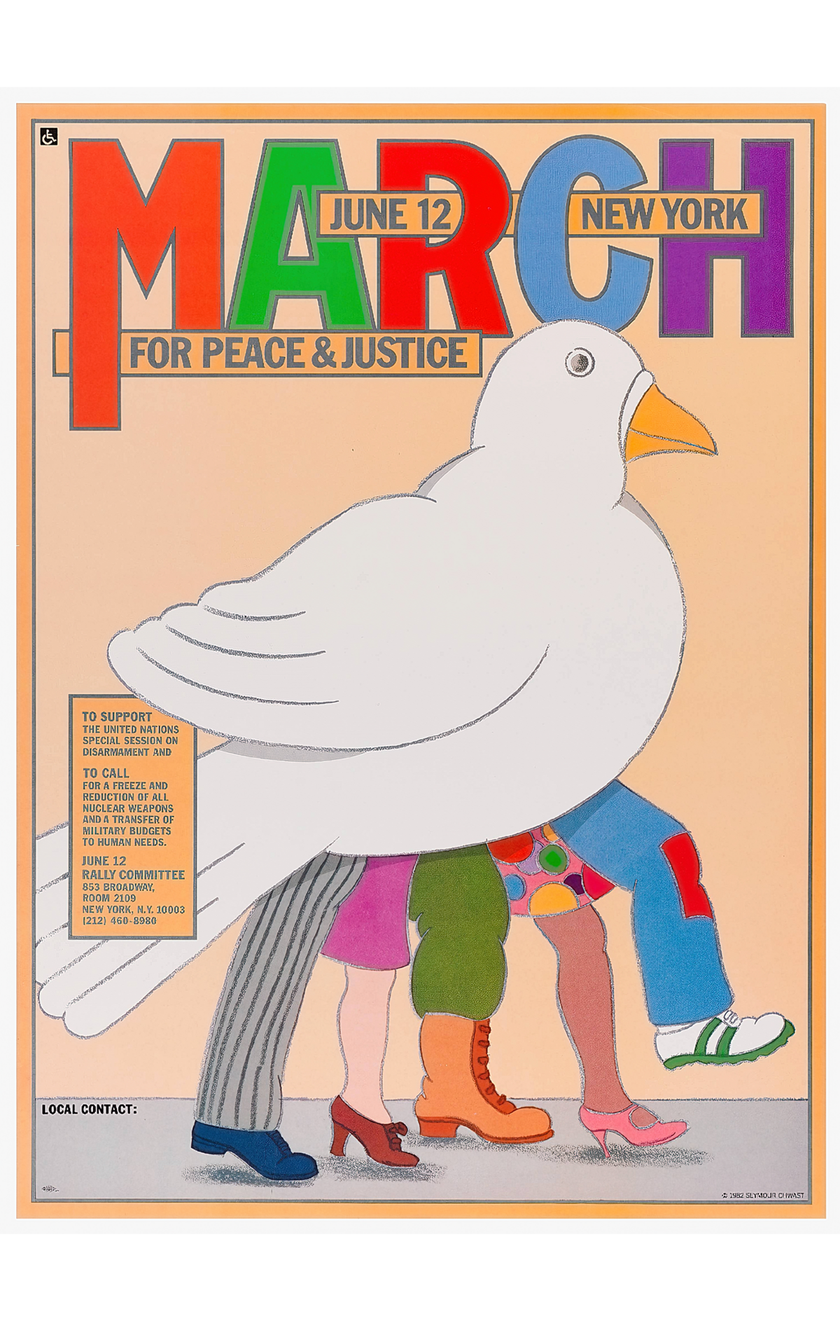
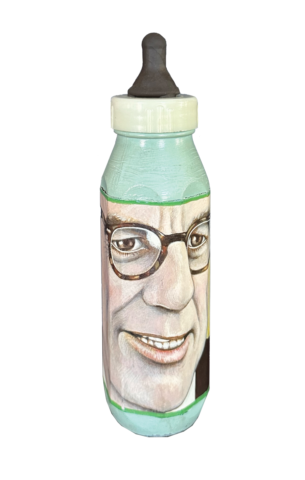
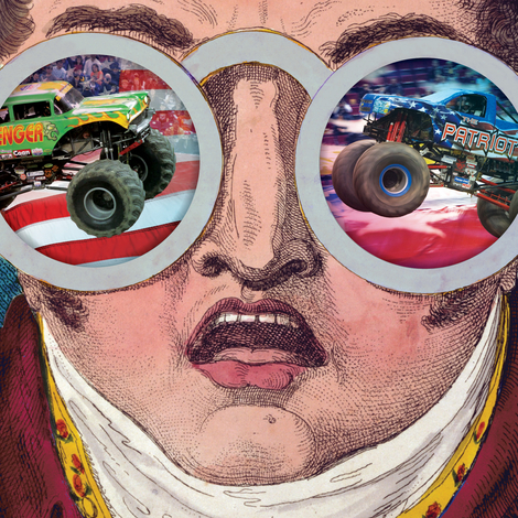
From its founding, in 1954, through Glaser’s departure, in 1975, Push Pin altered the country’s visual consciousness. Although Glaser and his partners—Seymour Chwast, Edward Sorel, and Reynold Ruffins—were all born between 1929 and 1931, the younger, baby-boom generation was most receptive to their exuberant eclecticism, a sampling of which is on view through December 30 at the Church in Sag Harbor, New York.
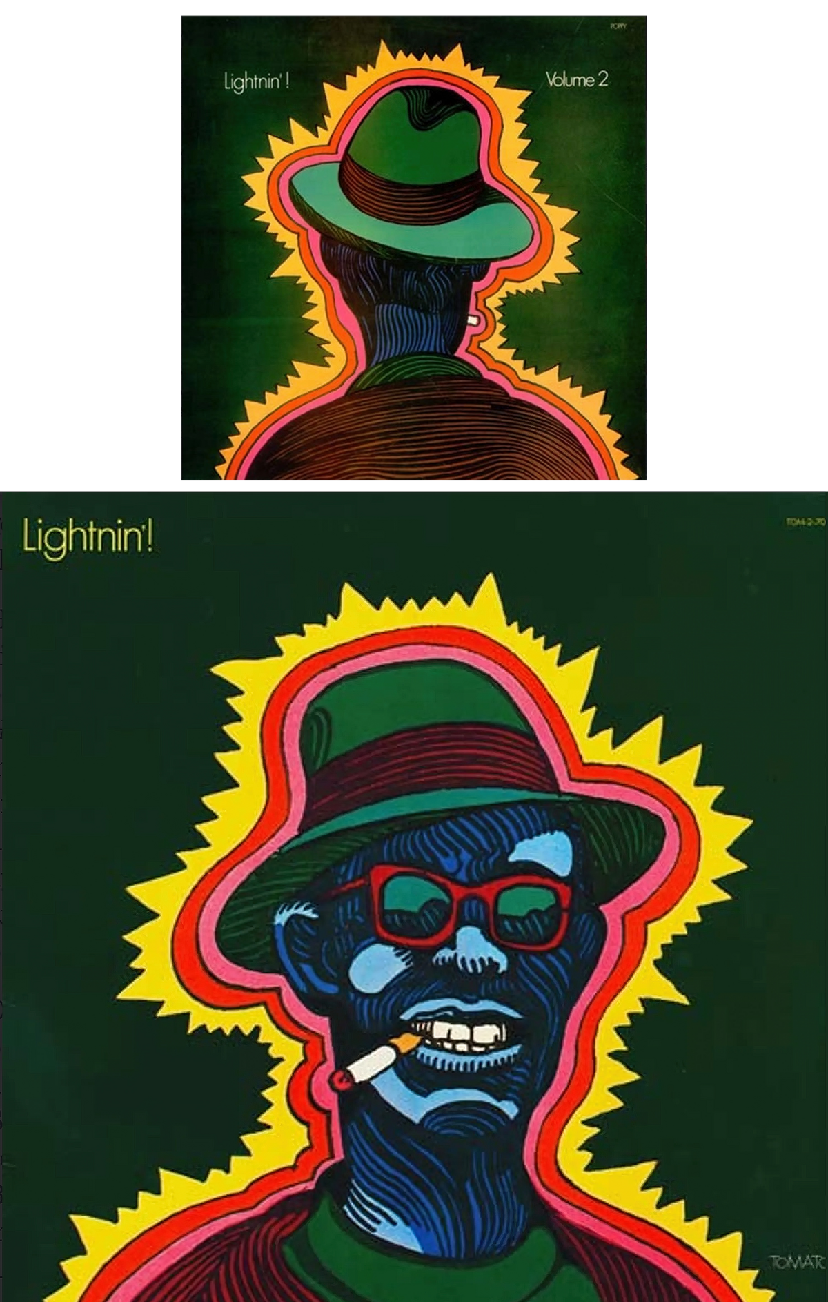
Push Pin achieved omnipresence not by landing big corporate accounts but through what people were starting to call pop culture, with a profusion of mass-market-paperback covers; album covers and band logos; posters for concerts, music festivals, art schools, and independent radio stations; plus lots and lots of editorial illustrations for Time, Life, Show, Esquire, Ramparts, Evergreen Review, and, especially, New York, which Glaser co-founded with Clay Felker.
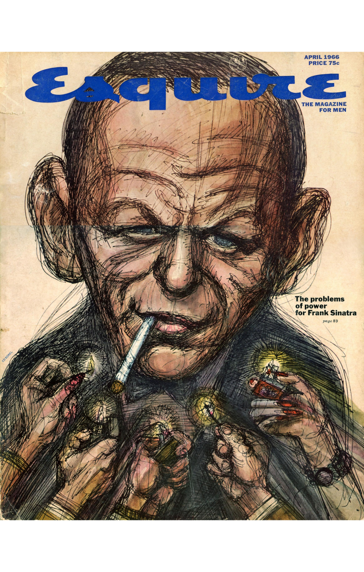
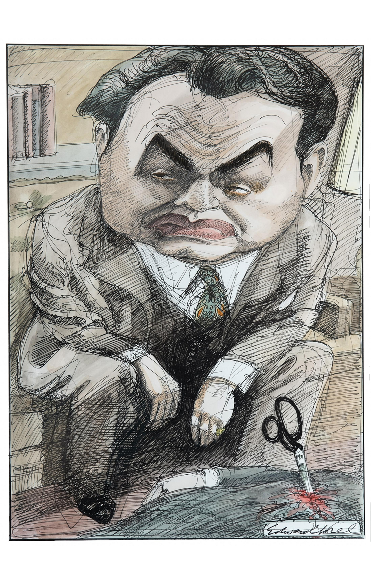
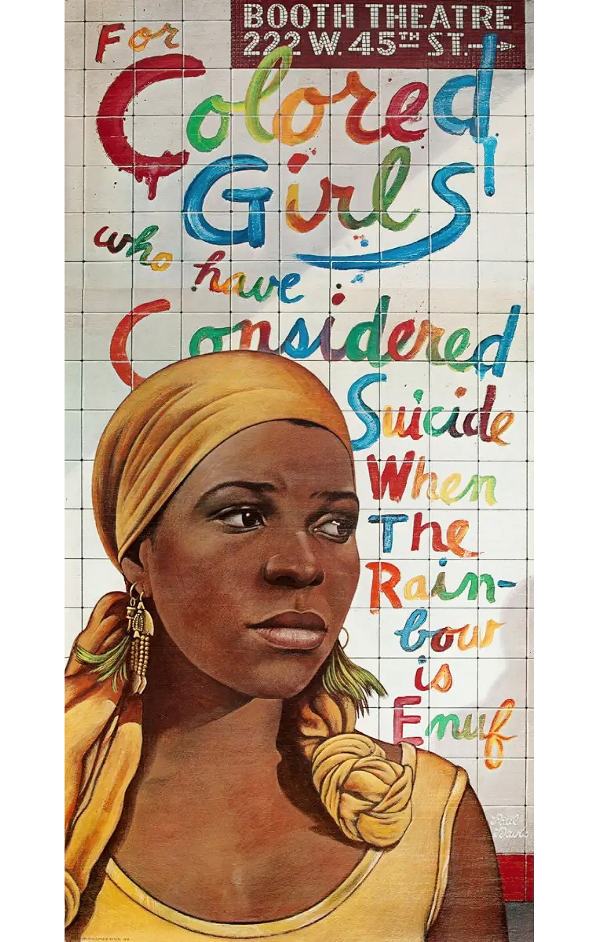
As New York’s design director, Glaser oversaw the magazine’s February 14, 1972, cover, announcing “The Birth of ‘The New Journalism,’” a genre that Push Pin could be said to have midwifed. Gay Talese’s 1966 Esquire story “Frank Sinatra Has a Cold” featured Sorel’s unmistakable pen-and-ink drawings; Tom Wolfe’s 1967 series, “The World of LSD,” soon to become The Electric Kool-Aid Acid Test, was accompanied by Glaser’s kaleidoscopic comic-book happening; Nik Cohn’s 1976 New York story “Inside the Tribal Rites of the New Saturday Night,” the basis for Saturday Night Fever, came to life via James McMullan’s photorealistic watercolors, which, unlike Cohn’s article, were scrupulously fact-based.
But while Push Pin is sometimes credited with the look of the 1968 Beatles movie, Yellow Submarine, in fact, Glaser turned the project down. “It was an awful lot of work,” he said.
Bump-Starts
Sorel taught himself to draw by making his own Dick Tracy strips while recuperating from a childhood illness. Eager to learn the fundamentals, he attended the Cooper Union, the prestigious, tuition-free art school in New York’s East Village.
Unfortunately for Sorel, modernistic abstraction was in, and the 5,000-year-old tradition of representing the human form was out. “Since no one on the faculty could teach figurative painting,” he wrote in his 2021 memoir, Profusely Illustrated, “I chose graphic design.” It was at Cooper that he first met Glaser and Chwast (pronounced kwast). They were “the top students” in the program; Sorel, by his own account, “was close to the bottom.”
In 1952, having been fired “close to 10” times since entering the workforce, he got a job designing subscription cards and spot advertisements for men’s magazines. One morning, Chwast sat down at the drafting desk in front of him. “I think he was humiliated,” Sorel wrote, “to find himself, two years after graduation, reduced to working side by side with one of Cooper’s least talented.”
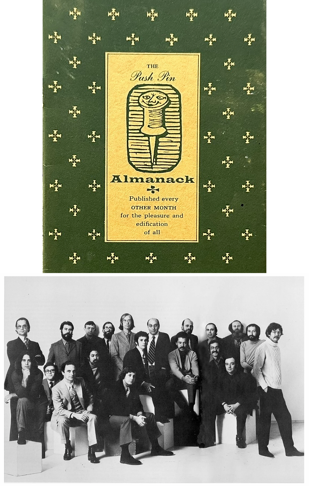
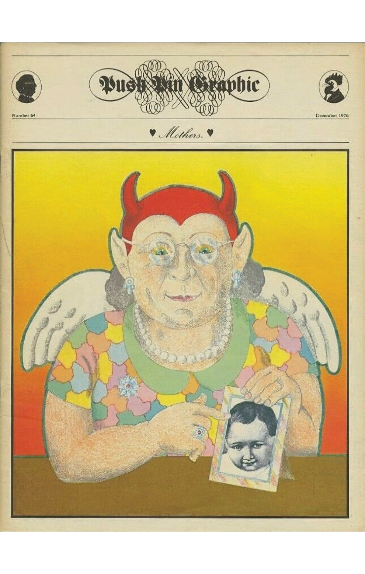
While listening to Chwast “kvetching” over lunch, Sorel suggested that the two of them could create a promotional piece to attract freelance work. Adopting the humble yet well-armed thumbtack as their mascot, he titled their showcase The Push Pin Almanack, the archaic spelling an early sign of their interest in, and irreverence toward, the passé. (It was later renamed The Push Pin Graphic.)
Sorel designed the first issue. Chwast designed the second. Ruffins, another Cooper alumnus, designed the third. Encouraged by the response, and newly unemployed, Sorel and Chwast established Push Pin Studios in a cold-water loft on East 17th Street.
Glaser had meanwhile ventured outside New York City for the first time, on a Fulbright scholarship, to the Academy of Fine Arts in Bologna, Italy, where he studied under Giorgio Morandi. “It really shifted me from the idea of modernism as being the only available resource to draw on for a young designer,” he said in the 2009 documentary Milton Glaser: To Inform & Delight. “I suddenly realized history was not the enemy.”
Upon his return, Glaser learned of his old classmates’ budding enterprise and wanted in. (As students, Glaser, Chwast, and Ruffins had a short-lived firm called Design Plus.) Sorel was against it, on the grounds that Glaser “would take over the whole studio,” but Chwast overruled him, believing that he had a lot to contribute. They were both right.
When Push Pin set up shop, commercial design and illustration were dominated by two styles: the technically accomplished Americana of Norman Rockwell and his Westport School imitators, and the austere, aristocratic modernism of Alexey Brodovitch and his fellow European émigrés. Here were three working-class Jews from the Bronx, raised on Superman, Walt Disney, left-wing politics, and, in Glaser’s case, Mueller’s spaghetti with Velveeta cheese and Heinz ketchup. They proved well adapted for a fast-changing, youth-oriented society in which the old distinctions between high and low no longer applied.
“A single way of doing things seemed too doctrinaire, too limiting,” Glaser said. “Part of it was a sense that [modernism] was used up. As the Chinese say: ‘Everything at its fullness is already in decline.’ We were looking at stuff that we had seen for many years, and it wasn’t going anywhere.”
Modernist designers, Sorel says, “were surgeons. They wanted everything clean. They were anal-compulsive,” whereas Glaser and Chwast “had wit. You looked at their stuff, and you smiled. It was their sense of humor that I think made them succeed.”
Ruffins became a partner in 1955. Then, the following year, Sorel and Glaser got into an argument, the details of which have long since been forgotten, and Sorel quit. “I understood that I was the weak link in the studio—that they really were tremendously inventive in terms of design,” he says. “And I liked being on my own.” So Sorel went freelance. Sixty-eight years, a stack of New Yorker covers, and two Manhattan-restaurant murals later, he’s still at it.
Blastoff
The studio moved in 1956 to East 57th Street, and again, two years later, to East 31st Street, and once more, in 1966, to a former Tammany clubhouse on East 32nd. McMullan and Paul Davis came aboard, as did John Alcorn and Samuel Antupit, among others. These new artists were selected not for their ability to riff on past crowd-pleasers but for what they could add to the repertoire.
“When they had their show at the Louvre, it was called ‘The Push Pin Style,’” design critic Steven Heller says. “Before that, they didn’t really think of it as a style—it was more an attitude.” As McMullan observes, “Paul and I were, in some ways, outsiders to the Push Pin style. But when you have all the work on the wall, we look like we really belong.”
To help manage the studio, they hired Myrna Mushkin in 1960, who parted with her Push Pin–soundalike maiden name after marrying Paul Davis. “I had a very convivial lunch with Milton and Seymour,” she recalls. “At the end, they said, ‘Will you take the job?’ I said, ‘What is the job? Can you at least give me a job description?’ And Seymour said, ‘Well, that’s one of the reasons we need you. We don’t know how to write a job description.’” Looking back, Myrna Davis defines her duties as “whatever was needed.”
Even as Push Pin expanded, it was the spirited back-and-forth between Glaser and Chwast—the Lennon and McCartney of the graphic arts, Heller calls them—that gave the studio its dynamism. “They were diametric opposites,” according to Myrna Davis, who co-curated the Sag Harbor exhibition with artist April Gornik. “Seymour was short. Milton was tall. Seymour came in at seven in the morning and left at seven at night; he was first in, last out. Milton would come in precisely at nine, with bagels.”
“Seymour was always very quiet,” Heller says. “Milton was the one who did the talking. They intersected at a certain point, but Milton’s aesthetic was defined by his intellect. Seymour was always more the intuitive one.”
Push Pin was more than a company of artisans plying their trade. “It really felt like the red-hot center of a lot of what was going on,” Myrna Davis says. “I was one of the first people—I think we were an audience of five or six—to hear the first reading of Bonnie and Clyde.” Robert Benton, one of the film’s screenwriters, was a friend of the studio’s, as were Dylan’s manager, Albert Grossman, and Ms. co-founder Gloria Steinem, whose magazine Glaser helped launch.
Inevitably, some of Push Pin’s ideas were just too far out, even for their adventurous clientele. If a presentation hadn’t gone well, “Milton would get his banjo and sing a song that he wrote, called ‘Rejection,’” Paul Davis recalls. “We’d all join in: Re-jec-tion, do it over again … ”
Push Pin was more than a company of artisans plying their trade. “It really felt like the red-hot center of a lot of what was going on.”
New York, which started as a supplement to the New York Herald-Tribune, became a stand-alone publication in 1968. Headquartered directly above Push Pin, its 40 employees shared a single bathroom and worked with their coats on in the winter months, under a leaky skylight. By 1971, the magazine had a circulation of 300,000. (Today the building is occupied by The New York Review of Books.)
Glaser “moved upstairs, where New York magazine was,” Chwast says. “He’d still do some Push Pin stuff, but after a while, we realized that it was over.” In 1974, Glaser established his own firm, Milton Glaser Inc., and officially left Push Pin the following year. “He was my best partner,” Chwast adds, “because our egos didn’t get in the way. We loved each other’s work.” Of the four founders, only Chwast was left. He kept the flag flying, and still does, but the Push Pin era was over.
And yet it never really ended. Glaser went on to design everything from restaurants (Windows on the World, the Rainbow Room), to brand identities (Grand Union, Brooklyn Brewery), to the immortal “I ❤️ NY” campaign, and he remained in high demand up to his death, on his 91st birthday, in 2020. Chwast, 93, has likewise received a steady stream of commissions since the mid-1970s, while illustrating more than three dozen children’s books.
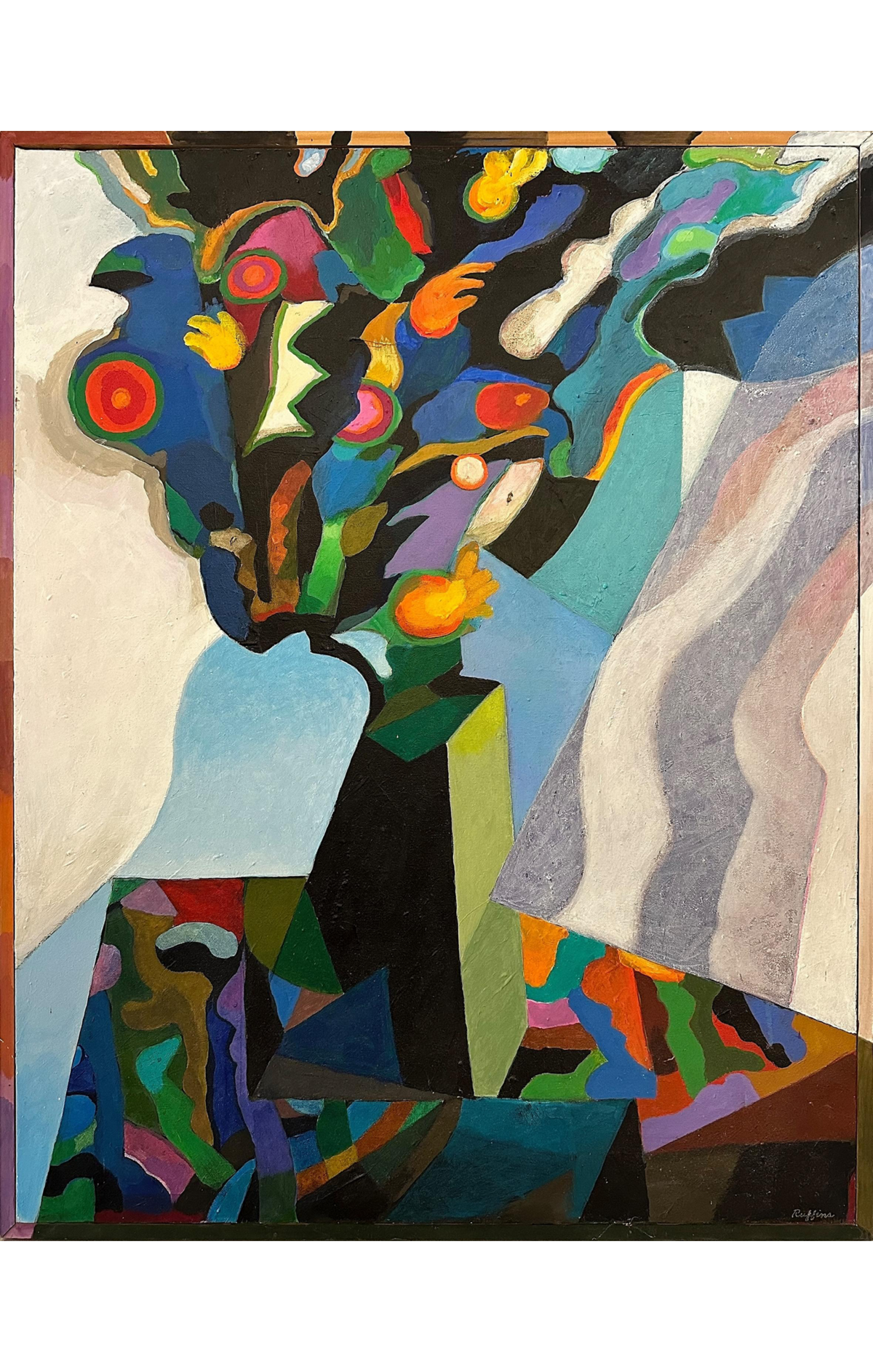
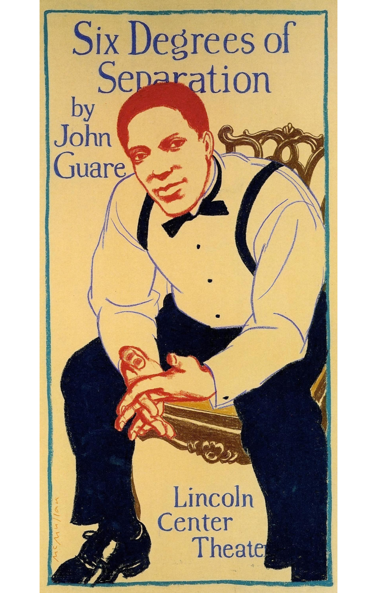
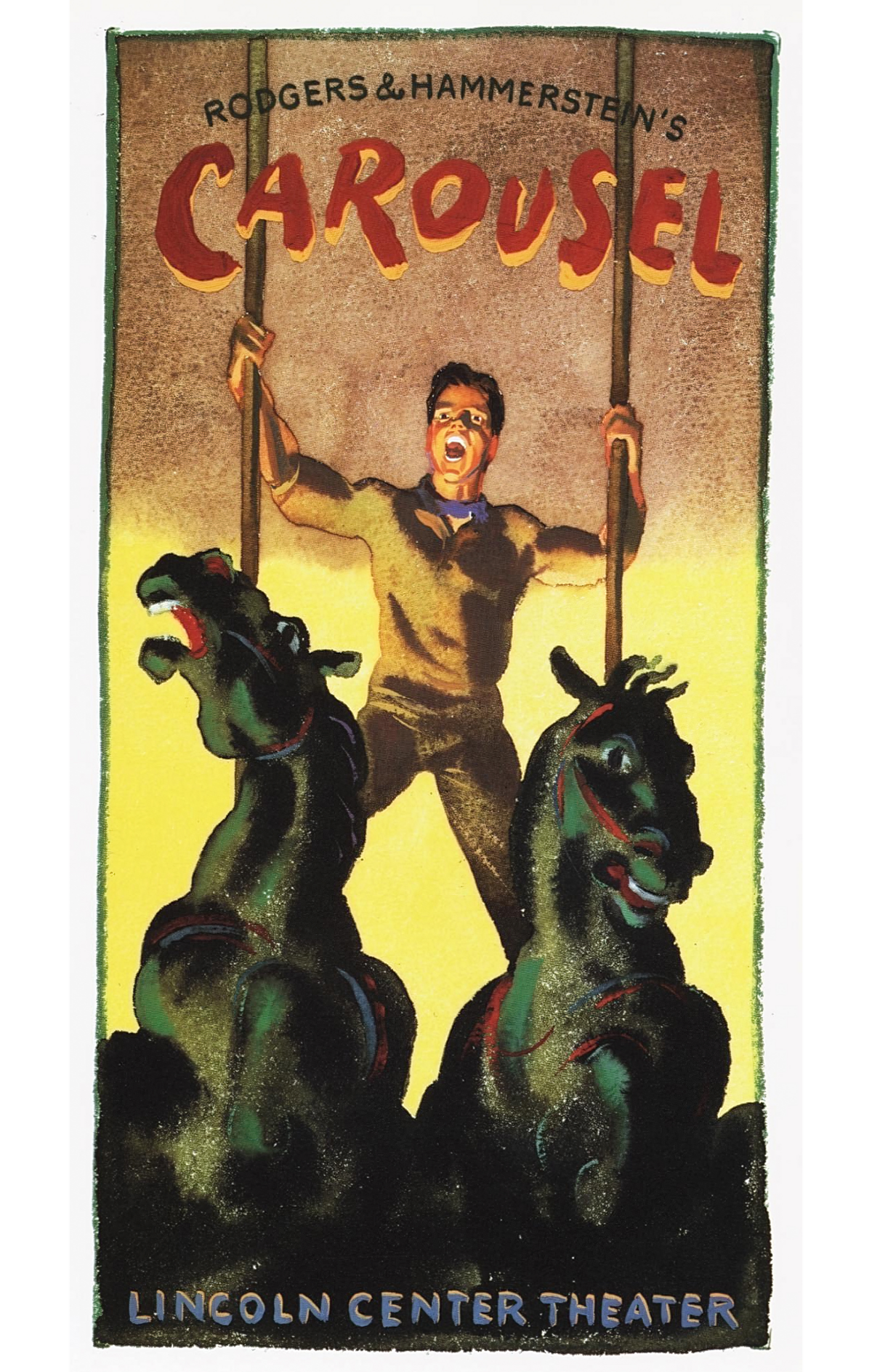
Sorel, 95, has produced volumes of political and literary caricatures and authored several books. Ruffins, who died in 2021 at 90, co-founded the design firm Ruffins/Taback after leaving Push Pin, and later pursued his own painting. McMullan, 90, has created nearly 100 posters for Lincoln Center Theater over the last four decades and published an illustrated memoir of his boyhood, Leaving China, in 2014. Davis, 86, was for a number of years the art director for the Public Theater under Joseph Papp and continues to paint prolifically. All six have had multiple solo exhibitions.
Unwilling to submit to any one artistic movement, Glaser and Chwast developed a kind of anti-method, which in time became so widely imitated it qualified for an “-ism.” According to Esquire editor Harold Hayes, “By the late 60s, museum curators were cataloguing modern graphics by two generics: post Bauhaus Swiss, and Push Pin Studio.” Having taken its place alongside Victoriana, Art Nouveau, Art Deco, and the other historical styles its artists impishly re-purposed for their own ends, the studio itself is now ripe for Push Pin–style appropriation.
“Yes, No, and WOW: The Push Pin Studios Revolution” is on at the Church in Sag Harbor, New York, until December 30
Ash Carter is a Deputy Editor at AIR MAIL and a co-author of Life Isn’t Everything: Mike Nichols as Remembered by 150 of His Closest Friends