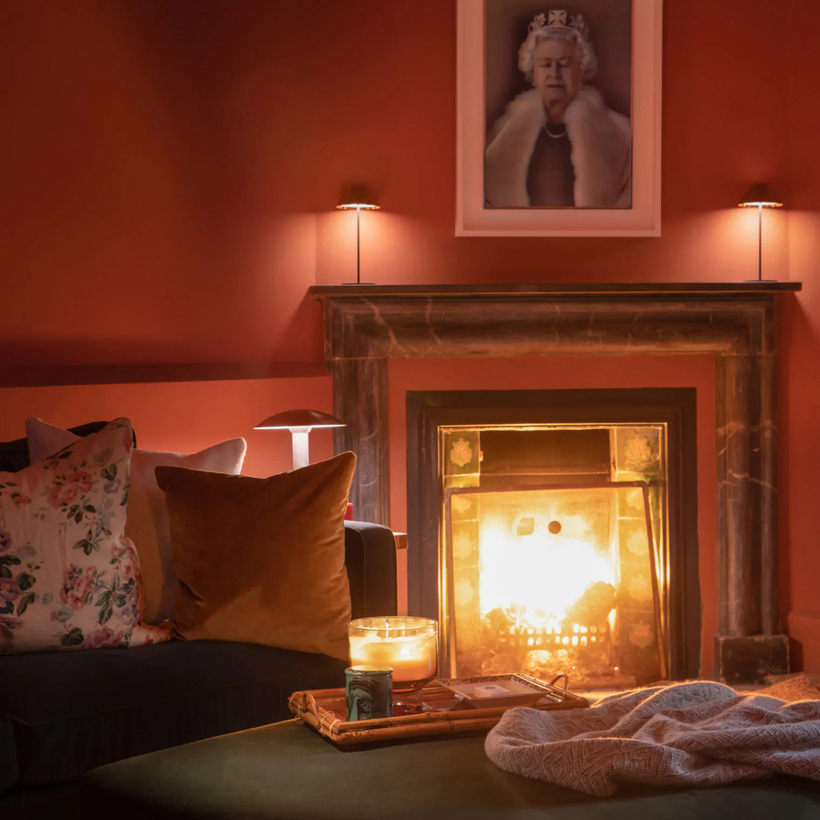
“Ben likes to say that his favorite color is ‘freshly laid cowpat,’” says Tamara Lancaster, design director at Ben Pentreath Ltd., referring to the flattened deposits of cow dung that litter the finer parts of the English countryside.
As one of the most sought-after architects in the U.K.—clients include King Charles—Pentreath’s literal down-to-earthiness might come as a surprise. “It’s a really sludgy, greeny brown,” Lancaster continues, and its beauty lies in its ability to conjure soggy walks, Wellington boots, and the smell of rain.
England is thoroughly obsessed with paint colors, and the companies that specialize in them are thriving far beyond Wiltshire and West London. Farrow & Ball, the biggest name in the business, has become a sensation in the United States, even though its paints cost at least $120 per gallon (compared with around $40 for those from Benjamin Moore).
In the U.K., Farrow & Ball has become so ubiquitous that some of the most discerning homeowners now turn up their noses at it, although their colors and quality remain excellent. “Farrow & Ball is our go-to,” says Lancaster. She and her colleagues especially rely on Shadow White and Pointing (shades of cream) as well as Cook’s Blue, a bright, saturated shade inspired by a kitchen cupboard at a historic home in Derbyshire.
But the hardware store has great colors, too. Where Farrow & Ball really excels is at the name game. Pigeon, Borrowed Light, Elephant’s Breath—they ignite the imagination, and they’re not completely nonsensical. The label on a can of Cook’s Blue, for example, not only tells the entire tale of the home in Derbyshire but also reminds us that it’s “perfect for use in kitchens as it is said to deter flies.”
Cow dung is a different matter. That visceral hue has been immortalized by a quintessentially English company called Papers and Paints. Instead of color names, it has codes. (This one is 04-050, if you really must know.) Owner Patrick Baty’s father opened the shop in Chelsea in 1960, and Baty has acted as adviser on numerous restoration projects, including the royal palaces, cathedrals, and museums. (He’s also a historian whose book, The Anatomy of Color, covers the previous four centuries of pigment and palette.) He not only offers a vast range of shades, but he’s able to match just about any that come through the door. “From a wallpaper to a book jacket to a scrap of fabric,” he says.
Edward Bulmer, another Farrow & Ball rival, has an equally popular shop on Pimlico Road in Belgravia. Especially known for his environmentally friendly credentials, he’s a pioneer in plant-based paint, and his shades leave a slightly chalky finish akin to plaster.
Bulmer is a favorite of the decorative painter Tess Newall, whose work adorns the walls of historic buildings and homes across the country. Recent projects include painting a frieze in the Great Chamber at Hever Castle, the childhood home of Anne Boleyn, as well as creating a timber-framed garden room in Buckinghamshire. “I prefer to use paints made with natural earth pigments like chalk and clay so they’re breathable,” she says.
Newall has become a sensation on Instagram, where more than 160,000 followers scrutinize her every brushstroke. The social-media platform has been a major driver of the frenzy for high-end paint and the cult-like status afforded to colors such as Bulmer’s Jonquil, a dusty pink that comes, Newall says, “without any sugariness.” (She also recommends his terra-cotta tones—Sang de Boeuf, Brick, and Header—and Tingry, a deep blue-black.
Now there’s yet another name in the mix: Rose Uniacke, known for designing the homes of David and Victoria Beckham, the writer and producer Peter Morgan, and fragrance maverick Jo Malone. She is selling her new range online as well as at her shop, just a few doors down Pimlico Road from Edward Bulmer.
“Our paint is entirely natural and chemical free,” she says. “The pure limewash actually absorbs CO2.” How exactly it does this remains hard to decipher, but the soft colors are exquisite. They should be chosen according to the quality of light, says Uniacke. “A north light requires a warmer tone,” she explains. Why not try Custard Cream, a creamy neutral with a touch of orange?
In England, where the sun sets as early as four p.m. in winter, light is a special consideration. For those in similar latitudes, Lancaster suggests an idea regularly deployed at Ben Pentreath: get a little shiny. “We recently did an entire dining room in a deep-blue gloss,” she says. “It’s dark, but you have lamps and candles, and the light bounces off the walls to create a snug feeling of glamour and warmth.” All that for just $120 a gallon!
Daisy Dawnay is a London-based writer