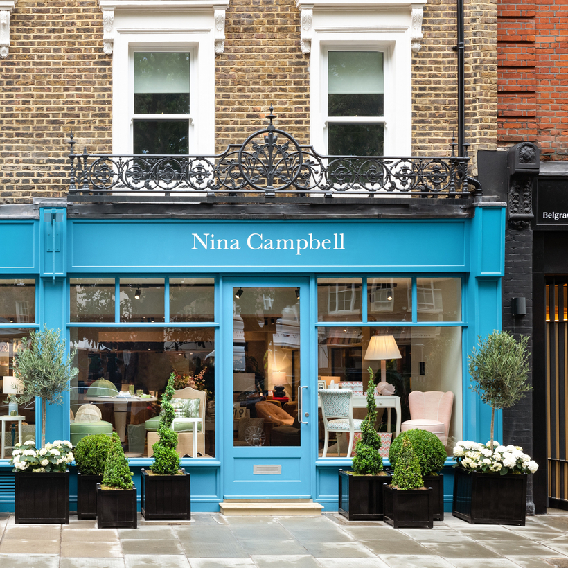
Sitting in her smart new boutique on Pimlico Road in London, Nina Campbell is reflecting on the changes she has seen after more than 50 years as one of the most influential figures of the British decorating scene. “These days, everything’s got to be new – what’s the new thing, what’s the trend?” she says. “I don’t really believe in trends; I think they’re rather ghastly, actually. I think if you do something well, it just endures.”
As well as being a sign of the endurance of her own work and style, Campbell’s latest venture is also something of a return: after training with the decorator John Fowler in the 1960s, she opened her first shop just down the street, at 64 Pimlico Road, in 1970.
Back then, she says, there was a rather different approach to decorating than she often finds now.
“When I first worked for John Fowler, on the whole we were repairing or restoring furniture, or going into the attic to find pieces to reuse in a different way,” she says. “Now, there’s a lot more shopping involved, more new things. But I always try to use whatever is already there: it gives a patina to a house, which I think is very important. That’s why old furniture is good; it’s comforting. But, thank God, people are starting to realize that you get much better value for old furniture, too.”
Her own style, she says, hasn’t changed that much over the past five decades, although it has “crisped up” somewhat. “I don’t have as many things now – although my children would probably laugh to hear that!” (She has three children: fellow interior designer Rita Konig, and son Max Konig and daughter Alice Deen, both of whom work with her.)
The things that she does have, particularly artworks, all hold a special meaning for her. “In my living room, practically every painting is either done by a friend or has been given to me by a friend, so it’s really like having a gallery of friends around you. I think you’ve got to have a point when you buy art: it either grips you with such passion that you have to have it, or it reminds you of something, or it’s done by somebody you know. Then I think you can just mix it all together.”
“I don’t really believe in trends; I think they’re rather ghastly, actually.”
That deft mix of color and pattern is one of Campbell’s signature strengths as a designer – and, of course, something that those who lack her designer’s eye might struggle to pull off with confidence. Her advice (which she is currently dispensing via an online course for Create Academy) is not to be too concerned about matching patterns and colors. “I think lots of people make the mistake of thinking this goes with this, and this doesn’t go, but it doesn’t all have to match,” she says.
“One client walked through his house when I’d finished it and said, ‘It’s amazing; nothing matches, but everything goes together,’ which was just what I wanted to hear.”
Her own line of furniture, fabrics and accessories demonstrates the joy that she finds in color and pattern, and also her passion for entertaining. Despite her attempts to have fewer things, tableware is something she finds “irresistible”. “I think a china cupboard needs to be highly organized, and mine is very regimented, but I’m afraid I have overspilled,” she admits.
“I love entertaining; I think it should be encouraged as much as possible. I can’t cook, but I love laying the table and I really take pride in that. If you have a wonderful table and good wine, you don’t need to worry too much about the food.”
Her interiors, whether they’re in the UK or abroad (she regularly works on American houses and also currently has projects in Jordan and Australia), are intended to make their inhabitants feel welcome, comforted and at ease when they walk through the door.
“I think your home should be something that doesn’t scream at you,” she says. “It should be somewhere you just want to sit down and talk to a friend, or read a book, or entertain.”
The following are some of her tips that will help you to achieve just that.
Find your own style
Don’t just listen to your friends. You have to hold your nerve and not get bamboozled by what they might say. John Fowler gave me wonderful advice, which is to buy what pleases your eye, and if it ceases to do so, get rid of it. You can make mistakes – you can look at something and think, ‘Was I drunk when I bought this?’ But if that’s the case, you can always sell it or give it away. You must trust your own eye, and if something gives you pleasure, for goodness’ sake have it.
Choose timeless design
Designing and decorating a house can be incredibly expensive, and therefore I believe one wants to achieve something that’s timeless. You can change a cushion or a lampshade later on, or move one chair out and another one in, but once you’ve done a room, you don’t want to think a couple of years later that it’s gone out of date.
Think about color and pattern
Think about where you are going to take your color inspiration from. Have you got a wonderful rug that you want to start with, or a favorite color that you want to work with? If a client is really nervous about color, I’ll say let’s just keep it neutral, but let’s have some colorful cushions. Then I just show them a few fabrics. I always say you don’t have to have lots of color, you could just cover one chair in a print, and if you hate it, it’s not the end of the world, you can change it.
I usually like to have my sofas and large pieces of furniture in a more neutral tone, because then I can pump them with cushions and use the stronger colors in smaller pieces.
When you’re using different patterns together, mix large and small, and keep away from using too many patterns of the same scale together. You can use a stripe and a check, for example, but if you use one check, stay away from another, unless it’s the same one scaled down. I believe you want one print that brings in a lot of colors, so you don’t end up just using two colors in a room.
Be strategic with paint
If you want a strong color in a room, it’s useful to have a dado rail so that you can put your strong color on the upper two thirds of the room and have a neutral or white shade below it, which reduces the strength of that color by one third. It allows you to use a strong color without it becoming too much.
In America, more often than here, they paint their woodwork in a strong color, and then have a lighter color on the walls. Sometimes the entire room will be painted top to toe in the same color, which can be rather effective. In England, we somewhat automatically go for off-white paint for the woodwork, but I think it’s fun to mix things up a bit.
Think about the ceiling: in my small house I’ve lacquered the ceiling in order to lift it and it’s had the most wonderful effect. When you light candles, it’s really reflective and it makes the ceiling appear higher.
I think one has to be very careful of anything termed “white” or “neutral”, because this is a minefield. You can have whites that have pink in them, whites that have yellow in them, whites that have green in them, and they don’t go together.
Turn a small space into a jewel
When designing a small room, one has to remember that they can be quite boring, so that’s your opportunity to make it into a little jewel with the colors and patterns you choose. There’s a sort of myth that you should paint a small dark room in a light color in order to bring light in, but I don’t think you can ever make a dark little room lighter by painting it light; much better to make it richer in color, accept that it’s not going to have much daylight, and rely on good lighting. When treated like this, small rooms often become the favorite room in the house; they draw you in.
See the hall as a gateway
When you’re decorating a hall, you can go in two directions: have a calm hall so that you feel calmed down when you arrive, and then you go into color in the rooms off it; or you might decide that the hall needs to be the bright color and the other rooms need to be in neutral colors.
Be clever with kitchen planning
I’ve got a few kitchen bugbears. I hate the wall cupboards falling too short of the ceilings to do anything constructive with the space so it becomes a dust trap. In my own kitchen I’ve added a mirrored panel above the cupboards so the ceiling disappears and I don’t have that layer of dust sitting on top of the cabinets.
In general, you don’t want to force yourself to walk too far in the kitchen. You want the sink, the oven, the dishwasher and the refrigerator in close contact with each other so that you don’t spend all your time rushing from one corner of the kitchen to the other.
The most valuable room in the house for me is the laundry. If there’s anywhere you can possibly have your washing machine, your dryer and a sink for soaking your clothes, all away from the kitchen, that’s the most desirable thing.
The sitting room is all about the seating
In a sitting room, in so many cases you find a sofa and two armchairs around the fireplace, which reduces the room to a really limited seating possibility. If you’ve got the opportunity to do two seating areas in a room, perhaps making space for a couple of chairs with a table where two people can sit and chat, that’s ideal. Try not to do all your seating in pairs, and think about how many legs you’ve got in a room: are they the same color and the same shape? If not, think about putting a valance on the sofa. And every chair or sofa has to be comfortably within reach of a table so that you can put your drink down.
A three-seater sofa is not all that useful, because three people never sit on it. If you’ve got a lot of space, a four-seater works, or just go for a large two-seater. You want to have some higher chairs, too: a room where everything is the same height looks really boring.
Invest in your bedroom
If it’s possible to have a walk-in closet in a bedroom, I think that’s the nicest thing; I’d rather take a few feet off a bedroom to create a walk-in – it gets the cupboards out of the room. If they are built in, I like to do something different so they don’t look like kitchen units: maybe make them a different color or paint on a design so they look like pieces of furniture not built-in units.
You should invest in your bed, as it’s where you spend so much of your time, and pay attention to your bedside table, too. You want room for your book, a lamp, water, all sorts of things, so have a decent-sized bedside table and make sure it’s at the right height for your mattress. A lot of bedside tables on the market these days are quite low, and if it’s too low for the height of your mattress, it’s completely unusable.
Make the bathroom a luxurious place
Bathrooms, for me, are really important; it’s part of the luxury of your house. If you’re tackling a small bathroom, don’t have too much built-in cabinetry. Pedestal basins and footed baths give the feeling of more floor space, which can double the size of the room visually. If everything is boxed in, your visual floor space is really small.
The importance of lighting
Lighting can make or break a house. When lighting any room, you need three different types: task lighting, ambient lighting and decorative lighting, and those all need to balance and work with each other.
Don’t forget the details
Details in interior design are very important. I’ve always said that lampshades and cushions are the shoes and handbags of the interior design business. If you change the cushions and the lampshades, sometimes it just elevates a whole room and gives it a fresh approach.
Jessica Doyle is the design-and-interiors editor at The Telegraph