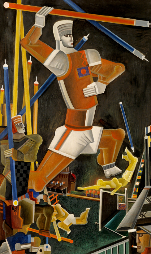
Scandinavia sat out the First World War. While the rest of Europe tore itself apart, a style of design filled with hope and optimism was quickening in Sweden. When the war ended, in 1918, the Nordic countries emerged from their cocooned neutrality, and Sweden re-engaged the world with a fully formed new movement in art and design. The new style won global attention at a series of international expositions, culminating in Paris at the 1925 Exposition Internationale des Arts Décoratifs et Industriels Modernes. And then, in 1930, the Swedes left it all behind. The movement they abandoned has been called “the Forgotten Modern,” but on the eve of its demise it was christened “Swedish Grace.” Celebrating the era—and the style—Stockholm’s Nationalmuseum has just opened the exhibition “Swedish Grace: Art and Design in 1920s Sweden.”
Scandinavian design entered the 20th century practicing a woolly version of the Arts and Crafts Movement, sometimes called “Viking Revival.” The new century brought industrialization, urbanization, and the first glimmers of Nordic social democracy to Sweden, changes that required a new visual vocabulary for everything from cups and saucers to civic architecture.
While the Continental avant-garde dreamed of a future filled with geometrically abstract, Bauhaus-designed objects, Swedish artists and designers envisioned a different look for the modern world. They consciously modified and combined styles from the past, melding the simple forms of the Swedish vernacular with motifs from classical antiquity, throwing in bits of ancient Egypt and China for good measure. Restraint and elegance were key.
The movement had one great advantage over abstract modernism. Its multicultural vocabulary of form and symbol could be used to tell stories—or even lighthearted jokes. In his astonishingly beautiful crystal-and-bronze celestial globe for Orrefors, Edward Hald portrays the constellation Canis Minor (the Lesser Dog) as a playful dachshund. And in a particularly impressive expression of wit, Eric Grate’s monumental 42-inch-tall cast-iron urn tells the story of its own manufacture, from raw ore to finished object, in muscular Neo-Grec bas-relief.
The storytelling was not limited to individual objects. An almost cinematic narrative was central to the period’s greatest work of Nordic architecture, the Stockholm Public Library. For its realization, architect Gunnar Asplund marshaled a small army of artists associated with Swedish Grace to construct an allegory of knowledge and literacy.
Bands of hieroglyphs stretch across the façades, but rather than images of Isis and Osiris there are bas-reliefs of perambulators and pitchforks, anvils and pull toys, humorously depicting the range of wisdom offered within. Anyone entering the library has to grab a door handle, crafted by Nils Sjögren, that portrays the naked Eve offering the fruit of knowledge. Inside, scenes from The Iliad sculpted by Ivar Johnsson evoke the dawn of Western literature. Asplund’s narrative climaxes with the cylindrical 80-foot-tall lending hall, a light-washed amphitheater of books lined with 40,000 volumes.
Just three years after the library’s completion, the 1930 Stockholm Exhibition burst onto the scene, and everything changed. Asplund, who led the fair’s design team, had undergone a profound conversion. The fair pavilions were built in a sleek steel-and-glass mixture of Bauhaus modern and Russian Constructivism that struck Sweden like a lightning bolt. Asplund strode away from the previous decade of design, and the country followed.
It was at the Stockholm Exhibition that P. Morton Shand, the English architectural critic and grandfather of Camilla Parker Bowles, eulogized the passing of “this halcyon godsend” of design and christened it “Swedish Grace.” —Lewis Jacobsen
“Swedish Grace: Art and Design in 1920s Sweden” is on at the Nationalmuseum, in Stockholm, through August 28
Lewis Jacobsen keeps an eye on art and design from his aerie in Upper Manhattan while overseeing his New York architectural practice