


“We’re not supposed to do it, but we do it anyway,” write David J. Alworth and Peter Mendelsund in The Look of the Book, a history of book-cover design from the 19th century to today. What we’re not supposed to do, as any child can tell us, is judge a book by its cover. “As readers and consumers, we’re all familiar with the pleasures and pitfalls” of superficial decision-making, the authors write. But the exquisite covers in this volume make a strong case for throwing caution to the wind and judging away.
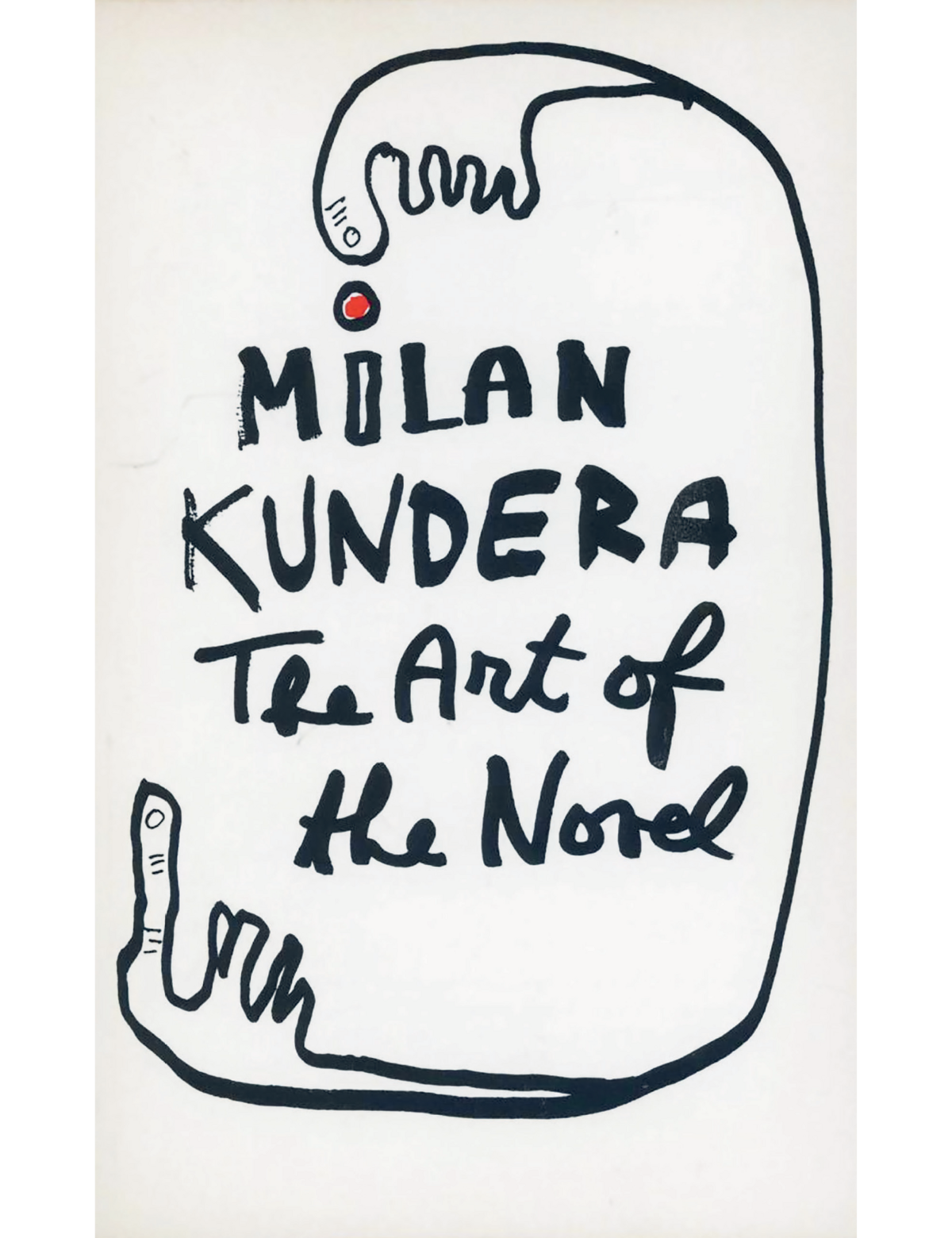
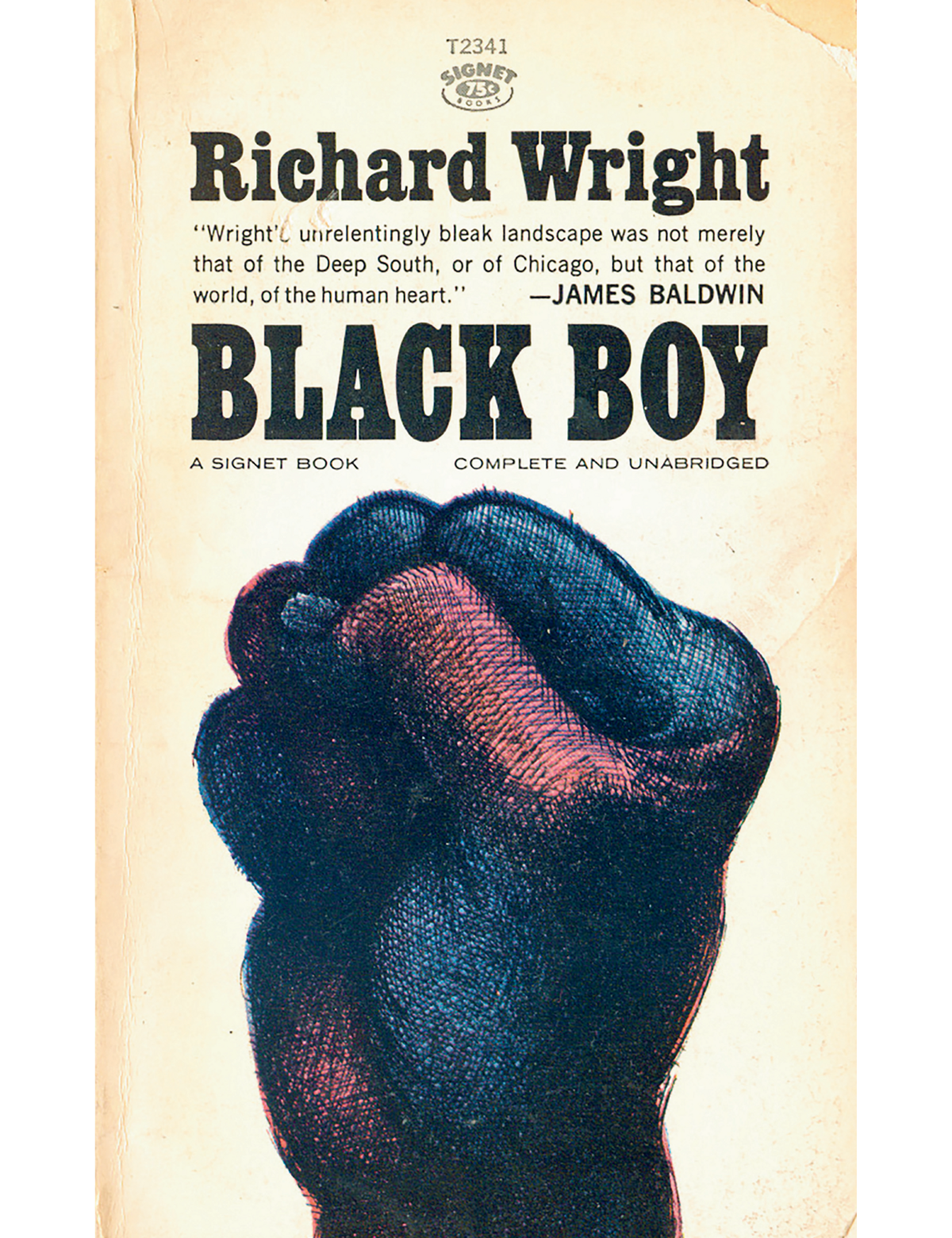
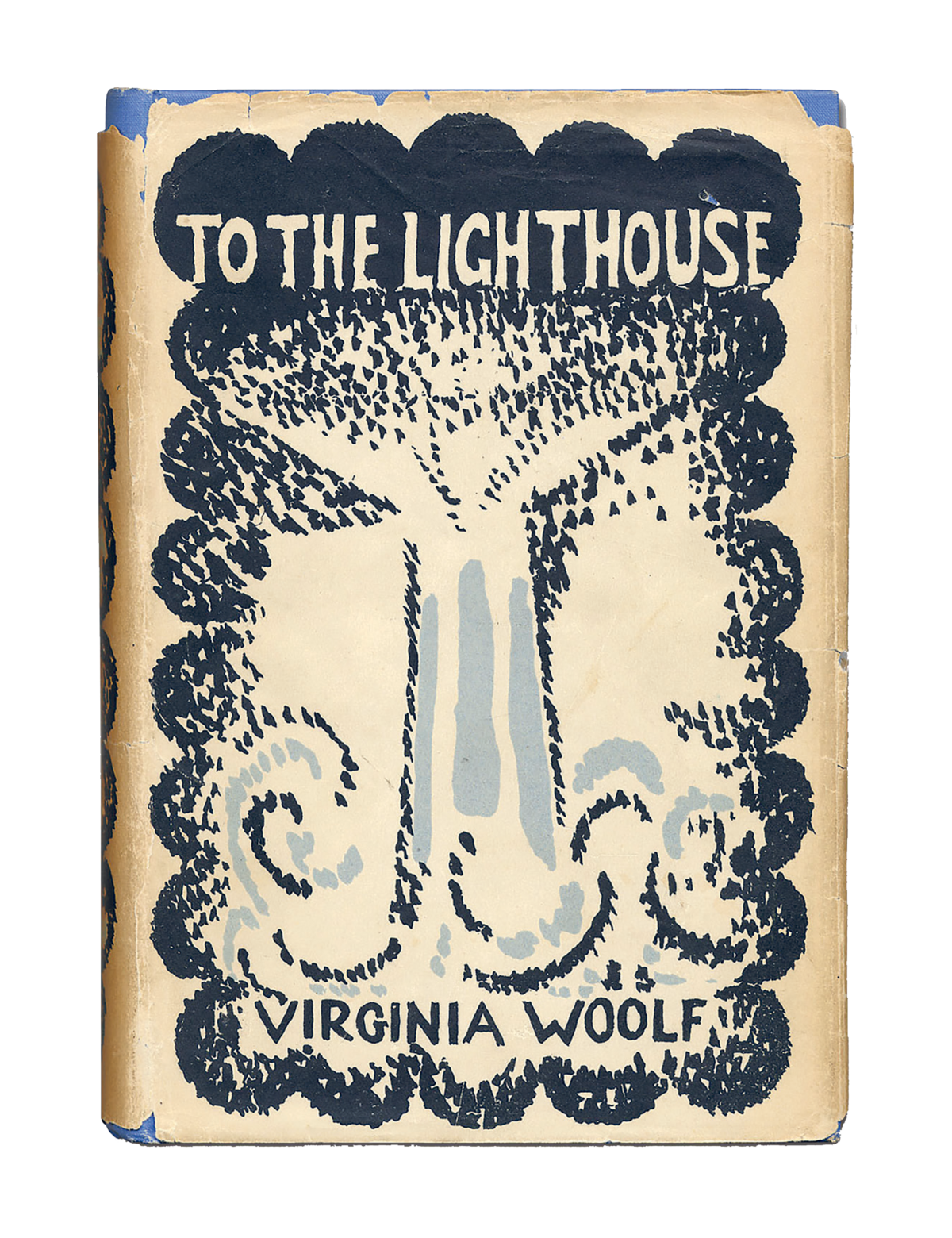
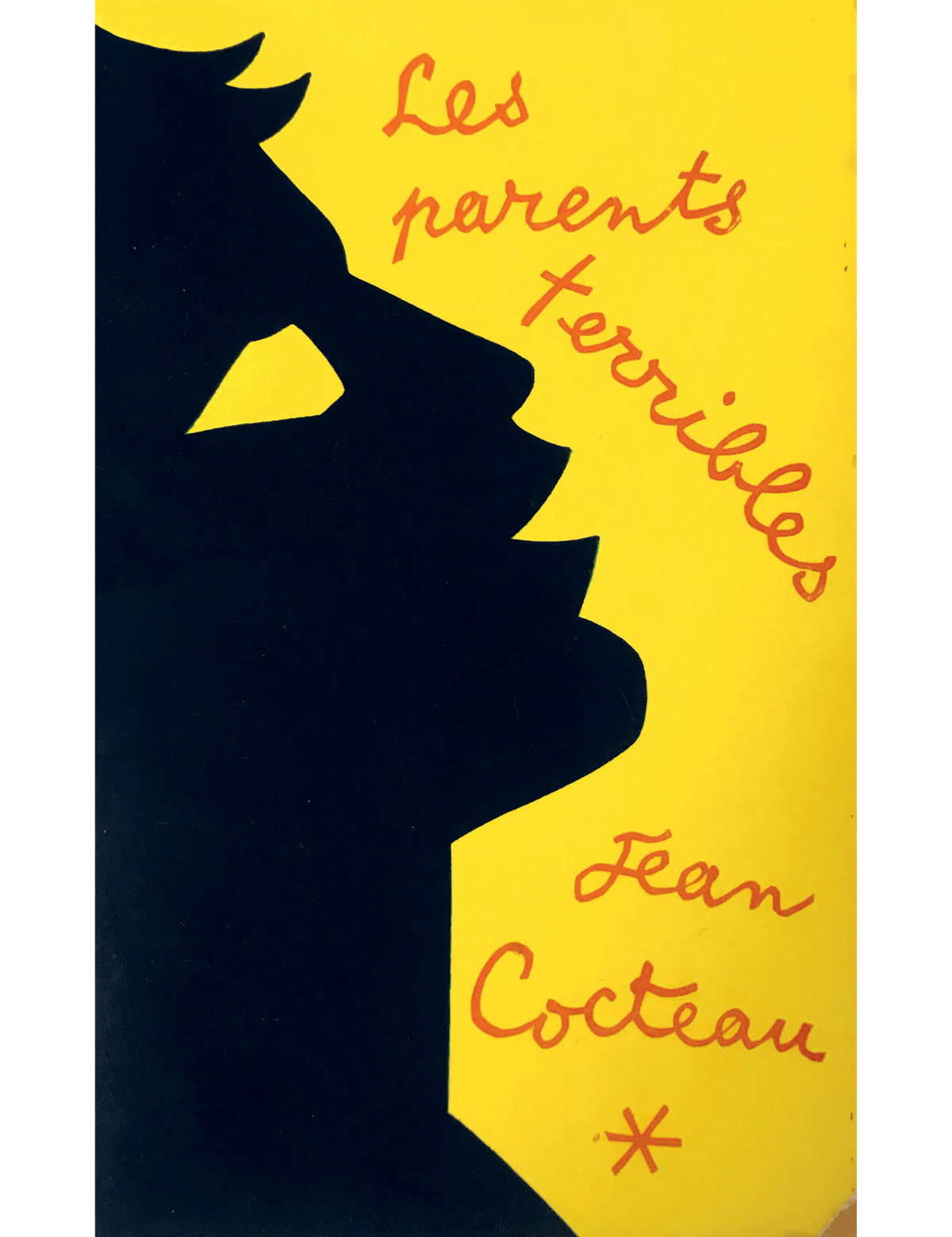
A time line of the book jacket’s evolution includes the all-knowing face transposed over a bright-blue sky designed by Francis Cugat for the first edition of F. Scott Fitzgerald’s The Great Gatsby (1925) as well as the scarlet horse by E. Michael Mitchell, designed for the first edition of J. D. Salinger’s The Catcher in the Rye (1951). The first printing of Virginia Woolf’s To the Lighthouse (1927), designed by Woolf’s older sister, Vanessa Bell, makes an appearance, as do the covers of Jean Cocteau’s Les Parents Terribles (1955) and Milan Kundera’s The Art of the Novel (1986), both of which were designed by the authors themselves. There are also uncredited classics, such as a 1964 cover of Richard Wright’s Black Boy.